| 일 | 월 | 화 | 수 | 목 | 금 | 토 |
|---|---|---|---|---|---|---|
| 1 | ||||||
| 2 | 3 | 4 | 5 | 6 | 7 | 8 |
| 9 | 10 | 11 | 12 | 13 | 14 | 15 |
| 16 | 17 | 18 | 19 | 20 | 21 | 22 |
| 23 | 24 | 25 | 26 | 27 | 28 | 29 |
| 30 | 31 |
- 데이터 증식
- WITH ROLLUP
- 데이터 정합성
- splitlines
- 리프 중심 트리 분할
- 캐글 신용카드 사기 검출
- 3기가 마지막이라니..!
- ImageDateGenerator
- lightgbm
- pmdarima
- 데이터 핸들링
- 분석 패널
- Growth hacking
- 그로스 마케팅
- DENSE_RANK()
- 부트 스트래핑
- sql
- 캐글 산탄데르 고객 만족 예측
- 그로스 해킹
- python
- WITH CUBE
- XGBoost
- 인프런
- 마케팅 보다는 취준 강연 같다(?)
- 스태킹 앙상블
- 그룹 연산
- tableau
- 컨브넷
- 로그 변환
- ARIMA
- Today
- Total
LITTLE BY LITTLE
[ch_05] Hands on Data Analysis With Pandas - Matplotlib, Pandas.plotting 본문
[ch_05] Hands on Data Analysis With Pandas - Matplotlib, Pandas.plotting
위나 2022. 10. 17. 23:12**Contents**
Matplotlib
1. Histogram (default)
2. Plot components
- fig.add_axes()
- plt.subplots()
- fig.add_gridspec (사이즈가 다른 subplots 생성)
3. Save plots ( plt.savefig() ), Cleaning up ( plt.close() )
4. Additional plotting options
- rcParams[ ]
- rcparams_list = list(mpl.rcParams.keys())
- mpl.rcParams['figure.figsize'] = (300,10) figsize 업데이트 가능 <=> plt.rc('figure', firsize= (20,20))
- rcdefault()로 default 복구
5. Pandas에서 지원하지않는 heatmaps - matplotlib에서 matshow()로 matrix 생성 가능
- df_corr = df.assign(log_feature1 = log(df.feature1), diff_feataure2 = df.feature2.max - df.feature2.min).corr()
- heatmatp과 colorbar 만들기 (ax.matshow(), set_clim, fig.colorbar() )
- column 이름들로 ticks 라벨링하기 ( labels = [col.lower() for col in df_corr.columns], ax.set_xticks ...)
- 박스에 coefficient 계수 값 포함시키기 ( for (i,j), coef in np.ndenumerate(df_corr): ax.text( ...) )
Pandas
- Line plots
- 특정 기간의 추이를 보여줄 때 ( kind의 default가 line)
- (kind, y, rigsize, color, linestyle, legend, title)
- 여러개의 plot을 한번에 그리고자 할 경우, y와 style에 리스트로 입력해준 뒤, plot.autoscale()해주기
- subplots=True 옵션으로 subplots 그리기, layout = (행,열) 옵션으로 subplots 개수도 지정 가능
- rolling() 연산 표현에 사용
- plot은 따로 그리고, 한눈에 보고자 한다면 fig, axes = plt.subplots()로 figure과 axes를 그려준 후, plot_name.plot(ax=axes[0], style = '-,c') 부터 axes[열개수] 까지 만들면 된다.
- Scatter plots
- 상관관계 시각화 ( kind = 'scatter' )
- log transformation으로 선형관계 확인 - plot(logx=True) 옵션
- Hexbins로 표현 - plot( kind = 'hexbin', colormap = 'gray_r', gridsize=20, sharex=False )
- gridsize는 그룹의 사이즈, 크게 설정할수록 hexagon의 크기는 작아짐
- sharex는 두 그래프의 x축을 동일하게 맞추어주는 옵션, True면 한개로 맞춰 출력됨
- 분포 시각화하기
- 히스토그램 (plot (kind='hist')
- plt.xlabel()
- KDE( Kernel Dnsity Estimation, kind='kde' )
- kde에서 히스토그램의 겹쳐진 부분을 볼 때 쓰이는 방법
- ax = df.feature1.plot(kind='hist', density= True, alpha=0.5) 희미하게 히스토그램을 그려주고
- plot( ax=ax, kind='kde' )로 kde에 앞서 그린 히스토그램에 plot 그리기
- kde에서 히스토그램의 겹쳐진 부분을 볼 때 쓰이는 방법
- CDF 확인하기 - Plotting the ECDF( Empirical Cumulative Distribution Function )
- from statsmodel.distributions.empirical_distribution import ECDF
- Boxplot (kind='box')
- notch = True를 하면 중위수에서 95%의 신뢰구간을 보여줌
- groupby()에 boxplot() 그릴 수 있음
- count와 빈도수 확인하기 - Bar Plot
- kind = 'barh'는 수평 막대를 보여주고, kind= 'bar'은 수직 막대를 보여줌
- df.groupby.plot.barh()로도 만들 수 있고, df,groupby.plot(kind='barh') 옵션에서 지정해도 됨
- Stacked bars - stacked = True 옵션
- Normalized stacked bars - normalized_pivot=pivot.fillna(0).apply(lambda x:x/x.sum(), axis=1) <= %로 바꾼 후 stacked bars 그리기
- 히스토그램 (plot (kind='hist')
pandas.plotting 모듈
scatter matrix
lag plot
autocorrelation plots
bootstrap plot
import matplotlib.pyplot as plt
import pandas as pd
Plotting lines - plt.plot()
fb = pd.read_csv(
    'data/fb_stock_prices_2018.csv', index_col='date', parse_dates=True
)

plt.plot(fb.index, fb.open)
plt.show()
plt.show() 하지 않아도 되는 %matplotlib inline
%matplotlib inline
import matplotlib.pyplot as plt
import pandas as pd

fb = pd.read_csv(
    'data/fb_stock_prices_2018.csv', index_col='date', parse_dates=True
)
plt.plot(fb.index, fb.open)
Scatter plots
data 일부만으로 그릴 수 있음 data=df.head(20)
plt.plot('high', 'low', 'or', data=fb.head(20)) # 'high', 'low'는 컬럼명How to format string

[color] [marker] [linestyle] 순서
히스토그램 plt.hist()
quakes = pd.read_csv('data/earthquakes.csv')
plt.hist(quakes.query('magType == "ml"').mag)
히스토그램의 bin 개수에 따라 다르게 그려지는 그래프
x = quakes.query('magType == "ml"').mag
fig, axes = plt.subplots(1, 2, figsize=(10, 3))
for ax, bins in zip(axes, [7, 35]):
    ax.hist(x, bins=bins)
    ax.set_title(f'bins param: {bins}')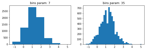
Plot Components
Figure
fig = plt.figure()Axes
Subplot 그리기 # of (rows, columns) 입력
fig, axes = plt.subplots(1, 2)
plt.subplots()대신 fig와 axes 직접 추가해도 됨 - 복잡한 레이아웃도 만들 수 있음 fig.add_axes()
fig = plt.figure(figsize=(3, 3))
outside = fig.add_axes([0.1, 0.1, 0.9, 0.9])
inside = fig.add_axes([0.7, 0.7, 0.25, 0.25])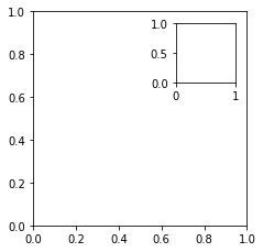
Plot layout을 gridspec으로 그리기 - 다른 크기의 subplots 생성 - fig.add_gridspec() => fig.add_subplots(gs[0,0]...)
fig = plt.figure(figsize=(8, 8))
gs = fig.add_gridspec(3, 3)
top_left = fig.add_subplot(gs[0, 0])
mid_left = fig.add_subplot(gs[1, 0])
top_right = fig.add_subplot(gs[:2, 1:])
bottom = fig.add_subplot(gs[2,:])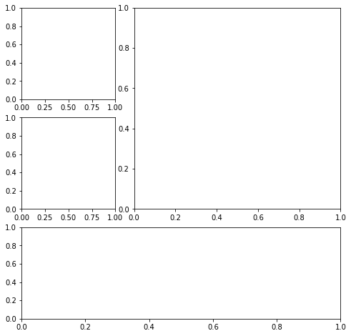
fig.savefig('fig.png')
fig.savefig('empty.png')plt.close() - 아무것도 입력안할시 close the last plot
plt.close('all')Plotting options
figure size 정하기 - plt.figure(figsize=(width,height))
fig = plt.figure(figsize=(10, 4))subplot 만들 때 같이 정할 수 있음
fig, axes = plt.subplots(1, 2, figsize=(10, 4))
Small subset of other plot settings ( with shuffling )
import random
import matplotlib as mpl

rcparams_list = list(mpl.rcParams.keys())
random.seed(20) # make this repeatable
random.shuffle(rcparams_list)
sorted(rcparams_list[:20])
default figsize 확인 - mpl.rcParams[figure.figsize]
mpl.rcParams['figure.figsize']
#[6.0, 4.0]
figsize 변경
mpl.rcParams['figure.figsize'] = (300, 10)
mpl.rcParams['figure.figsize']
#[300.0, 10.0]
reset (restore the defaults) - mpl.rcdefaults()
mpl.rcdefaults()
mpl.rcParams['figure.figsize']
# [6.4, 4.8]
같은 기능 by pyplot - plt.redefaults()
plt.rc('figure', figsize=(20, 20)) # change `figsize` default to (20, 20)
plt.rcdefaults() # reset the default
Plotting with Pandas

Plotting with Pandas
사용할 데이터
- Facebook''s stock price throughout 2018
- Earthquake data (2018.09.18~2018.10.13)
- Daily number of new reported casese of COVID-19 by country worldwide data (2020.19~)
Setting - 패키지, 데이터 불러오기
%matplotlib inline
import matplotlib.pyplot as plt
import numpy as np
import pandas as pd

fb = pd.read_csv(
    'data/fb_stock_prices_2018.csv', index_col='date', parse_dates=True
)
quakes = pd.read_csv('data/earthquakes.csv')
covid = pd.read_csv('data/covid19_cases.csv').assign(
    date=lambda x: pd.to_datetime(x.dateRep, format='%d/%m/%Y')
).set_index('date').replace(
    'United_States_of_America', 'USA'
).sort_index()['2020-01-18':'2020-09-18']
Line plots
로 evolution over time 확인 (kind 옵션의 default 그래프)
fb.plot(
    kind='line',
    y='open',
    figsize=(10, 5),
    style='-b',
    legend=False,
    title='Evolution of Facebook Open Price'
)
위에서의 style='-b'와 동일한 옵션 => color='blue', linestyle='solid'
fb.plot(
    kind='line',
    y='open',
    figsize=(10, 5),
    color='blue',
    linestyle='solid',
    legend=False,
    title='Evolution of Facebook Open Price'
);
y에 컬럼 리스트로 입력하여 여러 라인 그래프 그리기
fb.first('1W').plot(
    y=['open', 'high', 'low', 'close'],
    style=['o-b', '--r', ':k', '.-g'],
    title='Facebook OHLC Prices during 1st Week of Trading 2018'
).autoscale()
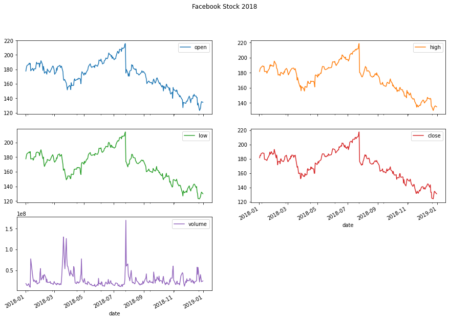
df.plot(subplots=True, layout=(rows,columns))로 subplots 그리기
fb.plot(
    kind='line',
    subplots=True,
    layout=(3, 2),
    figsize=(15, 10),
    title='Facebook Stock 2018'
)
비교하기 위해서 특정 변수로만 subplots 그리기
- 먼저 나라별로 이동 평균 확인
- 변동이 많기 때문에, 7-day moving average of new cases 를 rolling()옵션으로 그려서 확인해보자
- 비슷한 수를 가진 나라들은 같은 subplot에 나타나도록 그리자
new_cases_rolling_average = covid.pivot_table(
    index=covid.index,
    columns='countriesAndTerritories',
    values='cases'
).rolling(7).mean()
fig, axes = plt.subplots(1, 3, figsize=(15, 5))
new_cases_rolling_average[['China']].plot(ax=axes[0], style='-.c')
new_cases_rolling_average[['Italy', 'Spain']].plot(
ax=axes[1], style=['-', '--'],
title='7-day rolling average of new COVID-19 cases\n(source: ECDC)'
)
new_cases_rolling_average[['Brazil', 'India', 'USA']]\
.plot(ax=axes[2], style=['--', ':', '-'])
위의 그래프에서는 스케일이 달라서 비교할 수 없기 때문에 => area plot 사용하기
: combine height of the plots
cols = [
    col for col in new_cases_rolling_average.columns
    if col not in ['USA', 'Brazil', 'India', 'Italy & Spain']
]
new_cases_rolling_average.assign(
    **{'Italy & Spain': lambda x: x.Italy + x.Spain}
).sort_index(axis=1).assign(
    Other=lambda x: x[cols].sum(axis=1)
).drop(columns=cols).plot(
    kind='area', figsize=(15, 5),
    title='7-day rolling average of new COVID-19 cases\n(source: ECDC)'
)
이동평균 대신 누적 합계로 비교해보기
fig, axes = plt.subplots(1, 3, figsize=(15, 3))

cumulative_covid_cases = covid.groupby(
    ['countriesAndTerritories', pd.Grouper(freq='1D')]
).cases.sum().unstack(0).apply('cumsum')

cumulative_covid_cases[['China']].plot(ax=axes[0], style='-.c')
cumulative_covid_cases[['Italy', 'Spain']].plot(
    ax=axes[1], style=['-', '--'],
    title='Cumulative COVID-19 Cases\n(source: ECDC)'
)
cumulative_covid_cases[['Brazil', 'India', 'USA']]\
    .plot(ax=axes[2], style=['--', ':', '-'])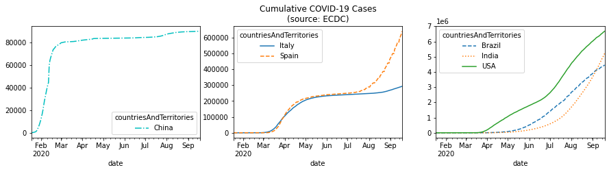
변수사이의 관계 시각화하기
Scatter plots
kind='scatter'
fb.assign(
    max_abs_change=fb.high - fb.low
).plot(
    kind='scatter', x='volume', y='max_abs_change',
    title='Facebook Daily High - Low vs. Volume Traded'
)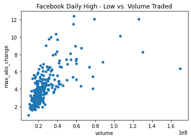
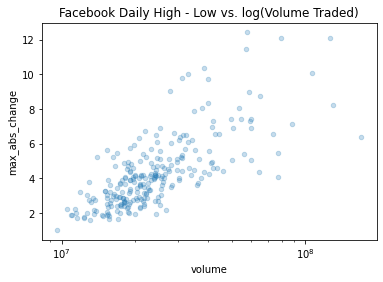
선형관계가 없어보임 => log tranform on the x-axis 적용하기 (두 변수의 scales of the axes가 달라서)
df.plot(logx=True)
fb.assign(
    max_abs_change=fb.high - fb.low
).plot(
    kind='scatter', x='volume', y='max_abs_change',
    title='Facebook Daily High - Low vs. log(Volume Traded)',
    logx=True
)
축 동기화 후 선형성이 보임
=> matplotlib에서는 plt.xscale('log')로 같은 기능 수행
alpha 옵션으로 투명성 추가 - overlapping된 데이터가 많을 때 유용 (0 transparent ~ 1 opaque, 디폴트는 1)
fb.assign(
    max_abs_change=fb.high - fb.low
).plot(
    kind='scatter', x='volume', y='max_abs_change',
    title='Facebook Daily High - Low vs. log(Volume Traded)',
    logx=True, alpha=0.25
)
df.plot(kind='hexbin',...gridsize=20) => hexbins 생성시 gridsize(=#of hexagons along the y-axis) 설정 필수
fb.assign(
    log_volume=np.log(fb.volume),
    max_abs_change=fb.high - fb.low
).plot(
    kind='hexbin',
    x='log_volume',
    y='max_abs_change',
    title='Facebook Daily High - Low vs. log(Volume Traded)',
    colormap='gray_r',
    gridsize=20,
    sharex=False # we have to pass this to see the x-axis
)
상관관계 표현 - 히트맵 ( matplotlib에서 matshow() 이용 )
fig, ax = plt.subplots(figsize=(20, 10))

# calculate the correlation matrix
fb_corr = fb.assign(
    log_volume=np.log(fb.volume),
    max_abs_change=fb.high - fb.low
).corr()

# create the heatmap and colorbar
im = ax.matshow(fb_corr, cmap='seismic')
im.set_clim(-1, 1)
fig.colorbar(im)

# label the ticks with the column names
labels = [col.lower() for col in fb_corr.columns]
ax.set_xticks(ax.get_xticks()[1:-1]) # to handle bug in matplotlib
ax.set_xticklabels(labels, rotation=45)
ax.set_yticks(ax.get_yticks()[1:-1]) # to handle bug in matplotlib
ax.set_yticklabels(labels)

# include the value of the correlation coefficient in the boxes
for (i, j), coef in np.ndenumerate(fb_corr):
    ax.text(
        i, j, fr'$\rho$ = {coef:.2f}', # raw (r), format (f) string
        ha='center', va='center',
        color='white', fontsize=14
    )
[Out]
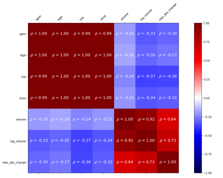
loc으로 correlation matrix 속의 값에 접근
fb_corr.loc['max_abs_change', ['volume', 'log_volume']]분포 시각화
Barplot
fb.volume.plot(
    kind='hist',
    title='Histogram of Daily Volume Traded in Facebook Stock'
)
plt.xlabel('Volume traded')
alpha(투명도) 옵션으로 히스토그램을 overlap시켜서 비교하기
fig, axes = plt.subplots(figsize=(8,5))

for magtype in quakes.magType.unique():
  data = quakes.query(f'magType=="{magtype}"').mag
  if not data.empty:
    data.plot(
        kind='hist', ax=axes, alpha=0.4,
        label=magtype, legend=True,
        title='Comparing histograms of earthquake magnitude by magType'
    )

plt.xlabel('magnitude')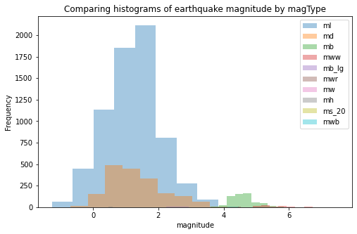
KDE
fb.high.plot(
    kind='kde',
    title="KDE of Daily High Price for Facebook Stock"
)
plt.xlabel('Price ($)')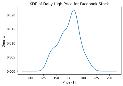
plot()메소드는 axes 오브젝트를 반환하기 때문에, 결괏값을 plot의 추가적인 customization을 위해서 저장할 수 있다.
ax = fb.high.plot(kind='hist', density=True, alpha=0.5)
fb.high.plot(
    ax=ax, kind='kde', color='blue',
    title='Distribution of Facebook Stock\'s Daily High Price in 2018'
)
plt.xlabel('Price ($)') # label the x-axis (discussed in chapter 6)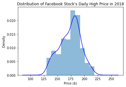
ECDF1
statsmodels 패키지 이용
from statsmodels.distributions.empirical_distribution import ECDF
ecdf= ECDF(quakes.query('magType=="ml"').mag)
plt.plot(ecdf.x, ecdf.y)

plt.xlabel('mag')
plt.ylabel('cumulative probabilty')

plt.title('ECDF of earthquake magnitude with mafType ml')
from statsmodels.distributions.empirical_distribution import ECDF

ecdf = ECDF(quakes.query('magType == "ml"').mag)
plt.plot(ecdf.x, ecdf.y)

plt.xlabel('mag')
plt.ylabel('cumulative probability')

plt.plot(
    [3, 3], [0, .98], '--k',
    [-1.5, 3], [0.98, 0.98], '--k', alpha=0.4
)

plt.ylim(0, None)
plt.xlim(-1.25, None)

plt.title('P(mag <= 3) = 98%')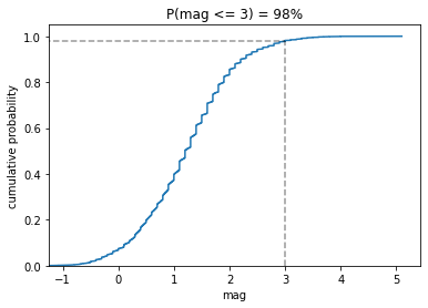
Box Plots
fb.iloc[:,:4].plot(kind='box', title='Facebook OHLC Prices Box Plot')
plt.ylabel('price ($)') # label the x-axis (discussed in chapter 6)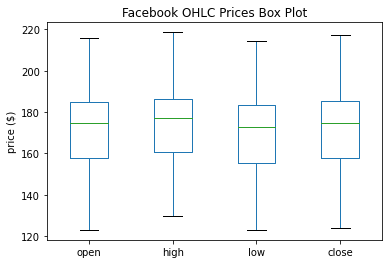
notch=True 옵션
fb.iloc[:,:4].plot(kind='box', title='Facebook OHLC Prices Box Plot', notch=True)
plt.ylabel('price ($)') # label the x-axis (discussed in chapter 6)
groupby()에 boxplot 그리기
fb.assign(
    volume_bin=pd.cut(fb.volume,3,labels=['low','med','high'])
).groupby('volume_bin').boxplot(
    column=['open','high','low','close'],
    layout=(1,3), figsize=(12,3)
)
plt.suptitle('Facebook OHLC Box Plots by Volume Traded', y=1.1)
subplots=False로 해서 한 그래프에 표현
#하나로 합쳐보자
quakes[['mag', 'magType']].groupby('magType').boxplot(
    figsize=(15, 8), subplots=False)
plt.title('Earthquake Magnitude Box Plots by magType')
plt.ylabel('magnitude')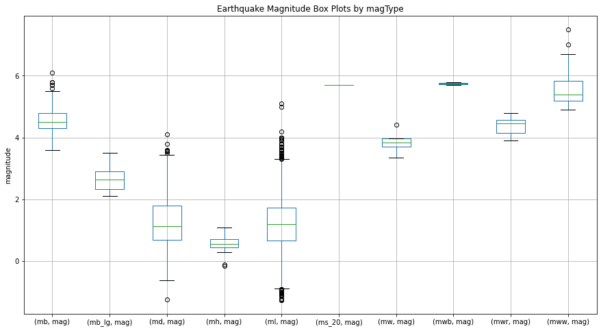
#subplots=True 로 바꿔보자
quakes[['mag', 'magType']].groupby('magType').boxplot(
    figsize=(15, 8), subplots=True
)
plt.title('Earthquake Magnitude Box Plots by magType')
plt.ylabel('magnitude')
Counts와 빈도
Bar Charts
kind = 'barh' (horizontal 수평)
지진이 일어난 15개의 상위 지역들 출력 iloc[14::-1, ]
quakes.parsed_place.value_counts().iloc[14::-1,].plot(
    kind='barh', figsize=(10,5),
    title="Top 15 Places fro Earthquakes"
          "(September 18, 2018 - October 13, 2018"
)
plt.xlabel('earthquake')
quakes.groupby('지역').tsunami.sum().sort_values.iloc[-10:,] => 쓰나미와 동반된 지진, 상위 10개 지역 출력
#tsunami와 동반된 earthquake를 보자
quakes.groupby('parsed_place').tsunami.sum().sort_values().iloc[-10:,].plot(
    kind='barh', figsize=(10,5),
    title="Top 10 Places for Tsunamis"
          "(September 18, 2018 - October 13, 2018"
)
plt.xlabel('tsunamis')
결과에서 1위 지역이 인도네시아 였으므로, 인도네시아 내에서의 지진과 쓰나미 발생 값만 출력해서 확인해보기
quakes.query('parsed_place == "Indonesia"').assign(
    time=lambda x: pd.to_datetime(x.time, unit='ms'),
    earthquake=1
).set_index('time').resample('1D').sum()
[Out]

resample대신 groupby에 pd.Grouper(freq='1D') 옵션으로 출력해도 같은 결과
#resample 대신 Grouper를 써도 동일하다
quakes.query('parsed_place == "Indonesia"').assign(
time=lambda x: pd.to_datetime(x.time, unit='ms'),
earthquake=1
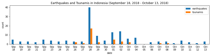
).set_index('time').groupby(pd.Grouper(freq='1D')).sum()1위 지역이었던 인도네시아에서의 발생률을 Daily basis로 시각화해보자
indo_quakes=quakes.query('parsed_place=="Indonesia"').assign(
    time=lambda x:pd.to_datetime(x.time, unit='ms'),
    earthquake=1
).set_index('time').resample('1D').sum()

indo_quakes.index = indo_quakes.index.strftime('%b\n%d')

indo_quakes.plot(
    y=['earthquake', 'tsunami'], kind='bar', figsize=(15, 3),
    rot=0, label=['earthquakes', 'tsunamis'],
    title='Earthquakes and Tsunamis in Indonesia '
          '(September 18, 2018 - October 13, 2018)'
)
plt.xlabel('date')
plt.ylabel('count')
[Out]
Grouped Bars
quakes.groupby(['parsed_place', 'tsunami']).mag.count()[Out]
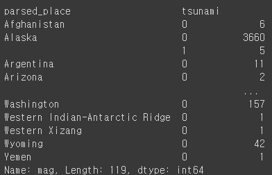
quakes.groupby(['parsed_place', 'tsunami']).mag.count().unstack()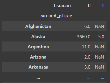
#표준화하기
quakes.groupby(['parsed_place', 'tsunami']).mag.count().unstack()\
.apply(lambda x:x/x.sum(), axis=1)
quakes.groupby(['parsed_place', 'tsunami']).mag.count()\
    .unstack().apply(lambda x: x / x.sum(), axis=1)\
    .rename(columns={0: 'no', 1: 'yes'})\
    .sort_values('yes', ascending=False)[7::-1]\
    .plot.barh(
        title='Frequency of a tsunami accompanying an earthquake'
    )

# move legend to the right of the plot
plt.legend(title='tsunami?', bbox_to_anchor=(1, 0.65))

# label the axes (discussed in chapter 6)
plt.xlabel('percentage of earthquakes')
plt.ylabel('')
[Out]

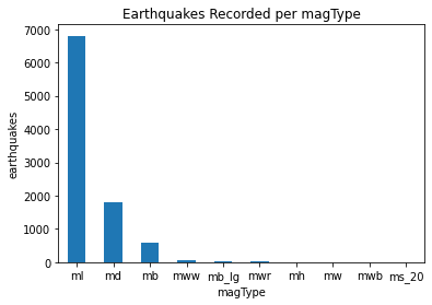
kind='bar'로 그리기
quakes.magType.value_counts().plot(
    kind='bar', title='Earthquakes Recorded per magType', rot=0
)

plt.xlabel('magType')
plt.ylabel('earthquakes')
[Out]
Stacked Bars
pivot=quakes.assign(
    mag_bin=lambda x:np.floor(x.mag)
).pivot_table(
    index='mag_bin', columns='magType', values='mag', aggfunc='count'
)
pivot.plot.bar(
    stacked=True, rot=0, ylabel='earthquake',
    title='Earthquakes by integer magnitude and magType'
)
[Out]

Normalized Stacked Bars ( %로 표현 )
normalized_pivot=pivot.fillna(0).apply(lambda x:x/x.sum(), axis=1)

ax=normalized_pivot.plot.bar(
    stacked=True, rot=0, figsize=(10,5),
    title="Percentage of earthquakes by integer magnitude for each magType"
)

ax.legend(bbox_to_anchor=(1,0.8))
plt.ylabel('percentage')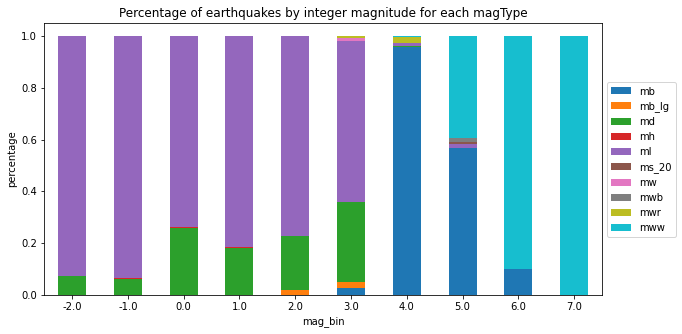
Pandas Plotting Module
Set up
%matplotlib inline
import matplotlib.pyplot as plt
import numpy as np
import pandas as pd

fb = pd.read_csv(
    'data/fb_stock_prices_2018.csv', index_col='date', parse_dates=True
)
Scatter Matrix
from pandas.plotting import scatter_matrix
scatter_matrix(fb, figsize=(10, 10))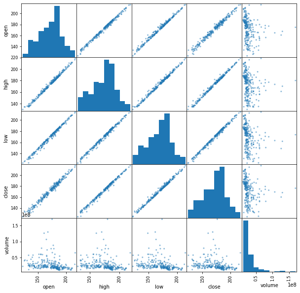
Scatter Matrix with kde
scatter_matrix(fb, figsize=(10, 10), diagonal='kde')

Lag plot : 과거 데이터와의 관계 확인
from pandas.plotting import lag_plot
np.random.seed(0) # make this repeatable
lag_plot(pd.Series(np.random.random(size=200)))
lag_plot(fb.close)
lag_plot(fb.close, lag=5)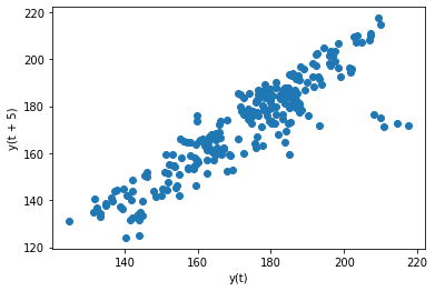
Autocorrelation Plots ( 관계가 의미있는지, 노이즈인지 확인하고자 할 때 )
from pandas.plotting import autocorrelation_plot
np.random.seed(0) # make this repeatable
autocorrelation_plot(pd.Series(np.random.random(size=200)))
=> random data는 자기상관이 없음 (바운더리 안에 있으면 없는 것)
autocorrelation_plot(fb.close)

=> close 변수는 있음 (바운더리 벗어남)
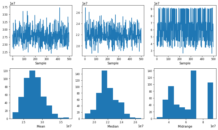
Bootstrap plot : summary statistics의 불확실성을 이해하는데 도움을 준다
from pandas.plotting import bootstrap_plot
fig = bootstrap_plot(fb.volume, fig=plt.figure(figsize=(10, 6)))